 “…Some highlights to look out for are a brighter and more cheerful colour palette, a more integrated and less visually noisy labelling style, subtle improvements to footpaths and minor roads, and cleaner building and land parcel rendering.”
One thing Google cannot be accused of is that it does not put continuous efforts into upgrading of its products and services. In fact, that constant tinkering with features and functionality gives an impression that all Google products are in a permanent state of development. With Google we never know what functionality is coming and when it will be available, or whether the product or service will survive in the long run as the company is not afraid to pull down underperforming applications. The most recent announcement is the closure of Google Labs with 56 experimental products. Product-specific Labs sites, like Gmail Labs, Google Maps Labs and Search Experiments, aren't affected by the decision.
Friday, 21 October 2011
New style for Google Maps
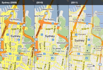
There is a good chance that you haven’t noticed subtle changes to cartographic design of Google Map that the company is continuously implementing. However, if you put different versions of Google Map side by side, it becomes very obvious how dramatically the appearance changed over the last few years. The key objective behind those changes is “… to make the map cleaner, more focused, more visually harmonious, and easier to use.”
 “…Some highlights to look out for are a brighter and more cheerful colour palette, a more integrated and less visually noisy labelling style, subtle improvements to footpaths and minor roads, and cleaner building and land parcel rendering.”
One thing Google cannot be accused of is that it does not put continuous efforts into upgrading of its products and services. In fact, that constant tinkering with features and functionality gives an impression that all Google products are in a permanent state of development. With Google we never know what functionality is coming and when it will be available, or whether the product or service will survive in the long run as the company is not afraid to pull down underperforming applications. The most recent announcement is the closure of Google Labs with 56 experimental products. Product-specific Labs sites, like Gmail Labs, Google Maps Labs and Search Experiments, aren't affected by the decision.
Subscribe to:
Post Comments (Atom)
No comments:
Post a Comment